Visualize Data in Python Using Matplotlib and Seaborn
Visualizing data helps us understand numbers more clearly, and Python makes this task easy with powerful libraries. In this tutorial, you will learn how to visualize data in Python using Matplotlib and Seaborn through simple and practical examples. This Matplotlib and Seaborn tutorial for beginners explains how to create charts and graphs step by step, even if you are new to data visualization. By the end, you will be able to plot clear charts in Python and use data visualization for basic data analysis.
While learning how to visualize data in Python using Matplotlib and Seaborn, you can explore the official documentation of Matplotlib documentation and Seaborn documentation for deeper knowledge.
Introduction to Data Visualization in Python
When working with data, numbers alone can be difficult to understand. Therefore, it becomes important to visualize data in Python using Matplotlib and Seaborn to transform raw information into clear and meaningful charts.
Data visualization helps beginners and professionals quickly identify patterns, trends, and relationships. In this guide, you will learn how to visualize data in Python step by step using simple and practical examples.
What Is Data Visualization and Why It Matters
- Firstly, data visualization means presenting data in graphical form, such as charts, graphs, and plots, so that complex information becomes easier to understand.
- In other words, instead of reading large tables of numbers, you can create visual charts that show trends clearly.
- Python is one of the most popular programming languages for visualization, especially because it provides powerful libraries like Matplotlib and Seaborn.
- Matplotlib is a foundational plotting library, which allows you to create line charts, bar charts, histograms, and many other basic visualizations.
- On the other hand, Seaborn is built on top of Matplotlib, and it provides more advanced and visually appealing statistical plots.
- Because of these libraries, beginners can easily learn data visualization in Python without complex coding knowledge.
- For example, you can use line charts to track changes over time, while bar charts are useful for comparing categories.
- As a result, Python visualization for data analysis becomes faster, clearer, and more insightful.
- Therefore, learning how to plot charts in Python for beginners is an essential skill, especially for students and aspiring data analysts.
Why Use Matplotlib and Seaborn for Data Visualization
- Firstly, Matplotlib is the foundation of Python data visualization, which means most other visualization libraries are built on top of it.
- Because of its flexibility, Matplotlib allows you to customize almost every part of a chart, including titles, labels, colors, and grid lines.
- On the other hand, Seaborn simplifies complex visualizations, especially when working with statistical data.
- In addition, Seaborn provides beautiful default styles, so beginners can create attractive charts without writing too much code.
- If you are learning how to plot charts in Python for beginners, these libraries provide simple syntax and clear documentation.
- Moreover, Seaborn works smoothly with Pandas DataFrames, which makes python visualization for data analysis more efficient.
- Another important advantage is strong community support, so you can easily find tutorials, examples, and solutions online.
- Furthermore, both libraries are widely used in data science and machine learning projects, making them valuable skills for career growth.
- Therefore, if you want to learn data visualization in Python step by step, starting with Matplotlib and Seaborn is a smart decision.
Setting Up Matplotlib and Seaborn for Beginners
Before you can visualize data in Python using Matplotlib and Seaborn, you need to install and set up these libraries properly. Fortunately, the setup process is simple and beginner friendly. Therefore, even if you are starting a matplotlib and seaborn tutorial for beginners, you can follow these steps easily.
Installing Matplotlib and Seaborn in Python
- Firstly, make sure Python is installed on your system.
- Next, check if pip is available, because pip is used to install packages.
- Then, open Command Prompt or Terminal on your computer.
- After that, type the following command to install Matplotlib:
pip install matplotlib
- Similarly, install Seaborn using this command:.
pip install seaborn
- If you are using Jupyter Notebook, you can also run:
!pip install matplotlib seaborn
- Once installed, these libraries are ready to use for python data visualization tutorial for beginners.
- As a result, you can now create python charts and graphs using matplotlib and seaborn easily.
Visualize Data in Python Using Matplotlib
Matplotlib is one of the most popular libraries used to visualize data in Python. It allows usto create simple charts like line plots, bar charts, and histograms with full control over design and customization. Therefore, if you are learning how to visualize data in Python step by step, Matplotlib is a great starting point.
It helps beginners understand how Python charts for data analysis work and makes it easier to build clear and meaningful visualizations.
Line Chart in Python Using Matplotlib
How to Create a Line Chart in Python Step by Step
					import matplotlib.pyplot as plt

years = [1990, 1992, 1994, 1996, 1998, 2000, 2003, 2005, 2007, 2010]
runs =  [500, 700, 1100, 1500, 1800, 1200, 1700, 1300, 900, 1500]

plt.plot(years, runs)
plt.show()
- Firstly,
import matplotlib.pyplot as pltimports the Matplotlib library. - Here,
pltis a short name for matplotlib.pyplot. - Next,
yearsis a list of values. - Similarly,
runsis another list of values. - After that,
plt.plot(years, runs)creates a line chart. - In this case,
yearsappear on the horizontal axis. - Therefore, the chart shows how runs changed over time.
- As a result, this simple code helps you visualize data in Python step by step.

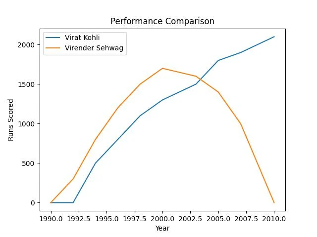
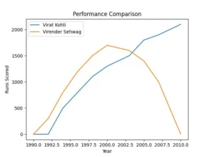
Compare Data Using Multiple Line Charts in Python With Matplotlib
					import matplotlib.pyplot as plt

years = [1990, 1992, 1994, 1996, 1998, 2000, 2003, 2005, 2007, 2010]
kohli = [0, 0, 500, 800, 1100, 1300, 1500, 1800, 1900, 2100]
sehwag = [0, 300, 800, 1200, 1500, 1700, 1600, 1400, 1000, 0]

plt.plot(years, kohli, label="Virat Kohli")
plt.plot(years, sehwag, label="Virender Sehwag")

plt.xlabel("Year")
plt.ylabel("Runs Scored")
plt.title("Performance Comparison")
plt.legend()
plt.show()
- Firstly,
yearsis a list of years. - Next, list of runs scored by
kohli. - Similarly,
sehwagis another list of runs, It represents the performance data for Virender Sehwag. - Then,
plt.plot(years, kohli, label="Virat Kohli")creates a line for Kohli. The label helps identify the line in the legend. - In the same way,
plt.plot(years, sehwag, label="Virender Sehwag")creates another line. - After that,
plt.xlabel("Year")adds a label to the X-axis. - Next,
plt.ylabel("Runs Scored")adds a label to the Y-axis. - then,
plt.title("Performance Comparison")adds a chart title. - After that,
plt.legend()displays the legend box. - Finally,
plt.show()displays the complete chart.
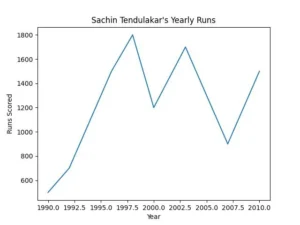
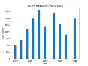
How To Plot Bar Charts In Python Using Matplotlib
Creating Your First Bar Graph in Python Using Matplotlib
					import matplotlib.pyplot as plt

years = [1990, 1992, 1994, 1996, 1998, 2000, 2003, 2005, 2007, 2010]
runs =  [500, 700, 1100, 1500, 1800, 1200, 1700, 1300, 900, 1500]

plt.bar(years,runs)
plt.xlabel("Year")
plt.ylabel("Runs Scored")
plt.title("Sachin tendulkar's yearly Runs")
- Firstly,
plt.bar(years, runs)creates a bar graph. - Next,
plt.xlabel("Year")adds a label to the horizontal axis. - Then,
Then, plt.ylabel("Runs Scored")adds a label to the vertical axis. - After that,
plt.title("Sachin Tendulkar's Yearly Runs")adds a title. - Finally, when you call
plt.show(), the graph appears on the screen.

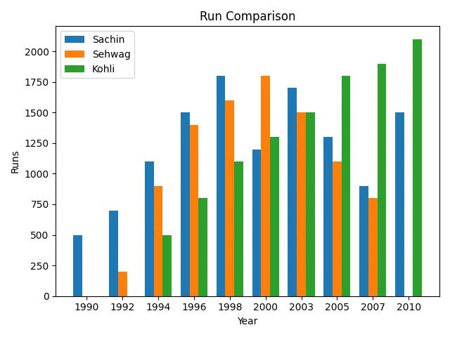
Comparing Values Using Bar Charts Using Matplotlib Step By Step
					import matplotlib.pyplot as plt

years = ["2010","2011","2012","2013","2014","2015","2016","2017","2018","2019"]

sachin = [500, 700, 1100, 1500, 1800, 1200, 1700, 1300, 900, 1500]
sehwag = [0, 200, 900, 1400, 1600, 1800, 1500, 1100, 800, 0]
kohli  = [0, 0, 500, 800, 1100, 1300, 1500, 1800, 1900, 2100]

x = range(len(years))
width = 0.25

plt.bar([i - width for i in x], sachin, width=width, label="Sachin")
plt.bar(x, sehwag, width=width, label="Sehwag")
plt.bar([i + width for i in x], kohli, width=width, label="Kohli")

plt.xlabel("Year")
plt.ylabel("Runs")
plt.title("Run Comparison")
plt.xticks(x, years)
plt.legend()
plt.tight_layout()
plt.show()
there are sachin , sehwag and kohli runs is given in form of list . We need to Create Bar Grph which compare their runs in different year.
- Firstly,
x = range(len(years))creates positions for bars. - Next,
width = 0.25sets the bar width, It controls how thick each bar looks. - Then,
plt.bar([i - width for i in x], sachin, width=width, label="Sachin")creates Sachin’s bars. - It shifts bars slightly to the left, its prevents overlap.
- After that,
plt.bar(x, sehwag, width=width, label="Sehwag")creates Sehwag’s bars. - Next,
plt.bar([i + width for i in x], kohli, width=width, label="Kohli")creates Kohli’s bars. - It shifts bars slightly to the right.
- As a result, three players appear side by side for each year.
- Then,
plt.xlabel("Year")adds a label to the X-axis. - Similarly,
plt.ylabel("Runs")adds a label to the Y-axis. - Next,
plt.title("Run Comparison")adds a chart title. - After that,
plt.xticks(x, years)replaces numbers with actual year labels. - Then,
plt.legend()displays the legend box.It identifies each player. - Moreover,
plt.tight_layout()adjusts spacing. - Finally,
plt.show()displays the complete grouped bar chart.

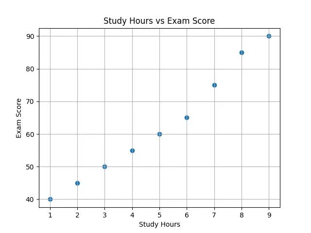
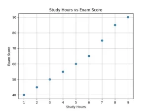
Creating a Scatter Plot with Matplotlib in Python
📊 What Is a Scatter Plot?
- Firstly, a scatter plot shows individual data points.
- Each point represents two values, one on the X-axis and one on the Y-axis.
- It helps identify patterns, trends, or relationships.
- For example, you can compare study hours and exam marks.
How to Plot Scatter Charts Using Matplotlib
					import matplotlib.pyplot as plt

# Sample data
study_hours = [1, 2, 3, 4, 5, 6, 7, 8, 9]
exam_scores = [40, 45, 50, 55, 60, 65, 75, 85, 90]

plt.scatter(study_hours, exam_scores)
plt.title('Study Hours vs Exam Score')
plt.xlabel('Study Hours')
plt.ylabel('Exam Score')
plt.grid(True)
plt.show()
- Firstly,
plt.scatter(study_hours, exam_scores)creates a scatter plot. - It places points based on study hours and exam scores.
- Each point shows one pair of values.
- Next,
plt.title('Study Hours vs Exam Score')adds a title. - Then,
plt.xlabel('Study Hours')labels the horizontal axis. - After that,
plt.ylabel('Exam Score')labels the vertical axis. - Moreover,
plt.grid(True)adds grid lines. - Finally,
plt.show()displays the complete scatter plot.
Histogram in Python Using Matplotlib for Beginners
If you want to visualize data in Python using Matplotlib and Seaborn, a histogram is a great tool to understand data distribution. It helps you see how values are spread across different ranges. Therefore, if you are following a matplotlib and seaborn tutorial for beginners, learning histograms is an important step in python visualization for data analysis.
📊 What Is a Histogram?
- Firstly, a histogram shows data distribution.
- It groups data into ranges called bins.
- Each bar shows how many values fall in that range.
- Unlike a bar chart, it shows continuous data.
- For example, you can use it to analyze exam scores, ages, or sales numbers.
Creating a Histogram with Matplotlib Step by Step
					import matplotlib.pyplot as plt

ages = [
34, 28, 36, 45, 27, 27, 45, 37, 25, 35,
25, 25, 32, 10, 12, 24, 19, 33, 20, 15,
44, 27, 30, 15, 24, 31, 18, 33, 23, 27,
23, 48, 29, 19, 38, 17, 32, 10, 16, 31,
37, 31, 28, 26, 15, 22, 25, 40, 33, 12,
33, 26, 23, 36, 40, 39, 21, 26, 33, 39,
25, 28, 18, 18, 38, 43, 29, 40, 33, 23,
33, 45, 29, 45, 3, 38, 30, 27, 30, 10,
27, 33, 44, 24, 21, 24, 39, 33, 24, 35,
30, 39, 22, 26, 26, 15, 32, 32, 30, 27
]
bins = [10, 20, 30, 40, 50, 60, 70]
plt.hist(ages, bins=bins, edgecolor='black')
plt.xlabel('Age Group')
plt.ylabel('Number of Viewers')
plt.title('Age Distribution of YouTube Viewers')

plt.grid(True, linestyle='--', alpha=0.5)
plt.show()
- Firstly,
plt.hist(ages, bins=bins,edgecolr='black')creates the histogram with black edge. - It divides data into 7 groups.
- Next, each bar shows how many ages fall in that range.
- Then,
plt.xlabel()adds a label to the X-axis. - After that,
plt.ylabel()adds a label to the Y-axis.It shows frequency. - Next,
plt.title()adds a heading to the chart. - Then,
plt.grid(True, linestyle='--', alpha=0.5)turns on the grid lines with dashed line and 50% transparency . - Finally,
plt.show()displays the histogram.

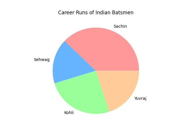
How to Plot Pie Charts in Python Using Matplotlib
If you want to visualize data in Python using Matplotlib and Seaborn, a pie chart is useful for showing proportions. It helps you understand how different parts contribute to a whole. Therefore, if you are following a matplotlib and seaborn tutorial for beginners, learning how to create a pie chart is an important step in python visualization for data analysis.
📊 What Is a Pie Chart?
- Firstly, a pie chart shows percentage distribution.
- Each slice represents a category.
- The size of each slice depends on its value.
- It works best when you compare parts of a whole.
Creating Pie Charts with Matplotlib for Beginners
					import matplotlib.pyplot as plt

plt.style.use("ggplot") # choose any style you like
labels = ["Sachin", "Sehwag", "Kohli", "Yuvraj"]
runs = [18000,8000,12000,9500]
plt.title("Career Runs of Indian Batsmen")
colors=["#ff9999","#66b3ff","#99ff99","#ffcc99"]
plt.pie(runs, labels=labels,colors=colors)
plt.show()
- Firstly,
plt.style.use("ggplot")applies a chart style. - Next, labels stores the player names.
- Then, runs stores total career runs.
- After that,
plt.pie(runs, labels=labels, colors=colors)creates the pie chart. - Finally,
plt.show()displays the pie chart.